Friday, 25 January 2013
Unity 3D
Hey today im going to talk about unity 3d. Unity 3d has been used to make ios games steam games and other cool games but thats not what im going to talk about im going to talk about the animation engine that it comes with.The animation engine is just amazing if you are looking to make a short film or just mess around this is what you should use. You can create running paths for characters to follow jumping points where they will jump. You can also have the camera follow the characters filming there moves. What you can do with this engine is just amazing there is so much to talk about i cant do it in a blog post i would recommend you watch some videos on youtube. But still its just amazing what you can do here is a link to where you can download. http://unity3d.com/
Saturday, 19 January 2013
Wallpaper

I want to start by saying that this was two wallpapers combined I found this on /r/wallpapers. I realize that a lot of the pics I post come from reddit but thats because the people there really do make good things. I would recommend people check reddit out if you have not already the people post lots of great art and interesting things. Now on to the wallpaper it is really cool the person that created this used two wallpapers to create this the person placed one wallpaper over the other wallpaper to create this great piece of work. I found it really interesting because of the way the image under the first image is centered. The people in the wallpaper are splice between a dark line. Also they are placed using rule of thirds creating, this creates a more interesting image for people to look at. So in short reddit can be a great place to find great images and art works, this wallpaper is interesting to look at. It also shows how people make cool and interesting images out of other image or other people art works.
Another /r/Pics

Really cool looking landscape pic

I found this the picture when i was looking for a new background for my PC. At first look you can see the northern lights across which looks to be a mountain rang. I really fined the colours in this picture very interesting. When looking at the picture you first see the light and the foreground but when you look past the light you see the mountains in the background. I think this is just amazing as the amount of time the person must have taken to set up the shot to get this exact angle. In short this picture is really interesting to me and I find the colours very cool
Thursday, 17 January 2013
Logo write up
LOGO ANALYSIS
My company is a video game
development company. We stride to create the best games on the market. We bring
sharp cutting edge graphics and movement engines to the world. My style is
modern and very futuristic.
In my logo I used
geometric objects like the circle and triangle. I used these shapes as the
triangle use bold strong lines. Which shows that my company is stable but powerful.
I also included the circle to show that the company is friendly and there for
its customers. The colours I used was red and blue. Red is a very royal colour
showing power and strength. The Blue is used to show unity and that the company
is peaceful and powerful at the same time.
The mood and feeling i
tried to create was a sense of friendship. I used the curvy line in the circle
to show the harmony between the circle and the triangle. I also what to create
the feeling of peace when you look at the logo. I find that the red complements
the blue very well creating a felling of peaceful power.
The logo I found worked best was
the combined logo. I think this because it shows the company name lets people
know who we are. I would say it meets all the criteria its clear and legible.
If I looked at it I would think its a computer or video game company. I also
think I used the space very well leaving positive and negative space.
Friday, 11 January 2013
Our stop motion animation
Our Stop-motion Animation was the story of two graffiti
artist and one friend. One day they went to do graffiti on the train tracks.
After finishing their graffiti art they step back to take a look at their work
when one of them steps in to the path of a on coming train. The other graffiti artist
is devastated at is friend lying with no legs, as they start to lose hope a
super hero comes in to save the day taking the hurt friend to the hospital.
We use sad music to create a sad feeling in the viewer. We
think the music worked really well with the video. It added an emotion to the animation instead of it just
being some random song
Thursday, 10 January 2013
Cool pic I found on Reddit/r/Pics

I personally think this picture is just amazing there is so much going on in the picture yet your eye still keeps being taken back to the bright blue sparks of the welder. Its not just the bright colours that bring your eye back to that one spot, its the way the photographer placed the focal point its not center its of to the side. The photographer used rule of thirds to do this, instead of having the focal point placed in the center looking very unrealistic, the focal point to the side creating an interesting view for the viewers.
Friday, 4 January 2013
Jase graffiti
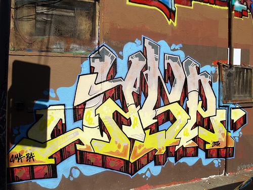
Hey today i'm going to talk about this awesome piece of graffiti. There are some really good reasons why this piece looks so nice. One the colours contrast really well with each other, no one colour seems to dominate the graffiti piece. Also the angle the picture was taken make the graffiti pop it makes the 3D look of the graffiti stand out more. Finally the lighting adds so much more to the picture, the only bad thing is the shadow of the street sign it really darkens up that one side of the picture.
Subscribe to:
Comments (Atom)